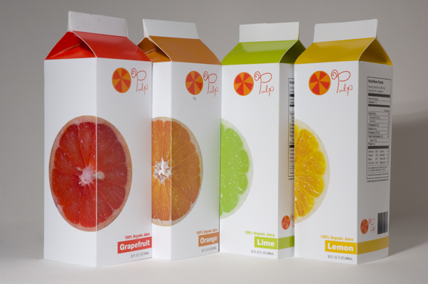
This assignment for my packaging design class was to create a three-part product line from scratch. I chose to do a line of organic fruit juices called Pulp. After developing a logo and logotype, I worked to create a system that could be applied to numerous varieties of juice in which each flavor would be immediately distinguishable yet the entire line would remain unified under the same brand.